Back in January I gathered a bunch of baby inspiration for the design of my friend Sarah's nursery and posted some of my finds in the blog entry "make room for baby!" With the baby due in June, time is of the essence, so my friend and fellow design enthusiast Camille (style handler) and I have been busy over the last month preparing the final design proposal for baby b's new bedroom.
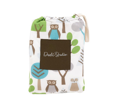
In my original post, I focused on many woodland themed elements, which became the inspiration for the room. Sarah knew she wanted a warm gray wall color with cream accents, which I immediately latched on to since it is such a fun and unusual palette! She and her husband Dan also picked out some adorable black furniture, which would be accessorized with the the cutest owl sheets from Dwell Studio.

After a trip down to her house to get measurements of the space, I immediately began a 3D model of the room using SketchUp (a free Google software for any of you interested in a fantastic design tool). Once I had the room in place, I modeled the crib and some of the other pieces of furniture in the room to get a very clear understanding of space and layout.
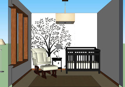
Once I had modeled the space, Camille and I sat down for a design session to figure out where to place the various pieces of furniture and what to do with the walls. It was during this session that we came up with our first iteration for the nursery (see below). We placed a large silhouette of a tree on the wall between the crib and the rocking chair to give a fun, yet simple and calming, design element to the room.

We loved this design as a starting point, but decided to work on the form of the tree to make it a bit more simplified. We also knew that the final design would need to work with light tree on a darker wall, so bigger and bolder shapes would probably work best.
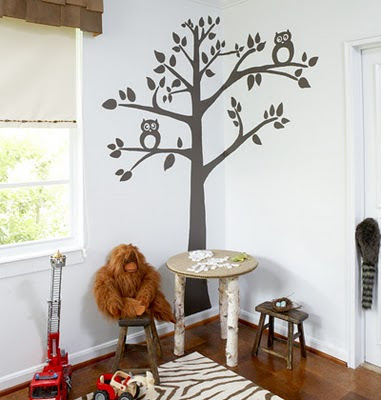
After a trip to Home Depot to hash out the final paint color scheme (we ended up with a gorgeous warm gray and light buttery cream palette), we looked through some various tree designs with Sarah and came to one of the images I had originally posted on my blog. We loved the simple design of this tree, but decided to remove the owls and change the proportions a bit.

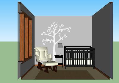
Once we had finalized the design, I uploaded the new tree into the SketchUp model so that I could provide Sarah with a final preview of the concept for the nursery before we began work on the space.

With Sarah on board, all we needed to do was start painting! I'll post more details this week...


Thanks for the tip about SketchUp! I'm planning to redo my office/guest room this summer and this will be so helpful. Love the vibe you girls have come up with and can't wait to see the end results!
ReplyDelete-Katie @ Haute Apple Pie