Sunday, July 11, 2010

teen room design

I have yet another room to design and I am pumped! My neice, Kenzie, is ready for a refresh of her bedroom. She's a freshman in high school and her favorite colors are orange, green, and blue. She wants to incorporate these colors in to her new room design, but was thinking about a more toned down palette on her walls with some punches of color via accessories. To jump start the room design process, I hit the web and have organized a bunch of photos for inspiration and possible directions. I have no idea if Kenzie would be interested in any of these ideas, but it should at least get us started!

The details...

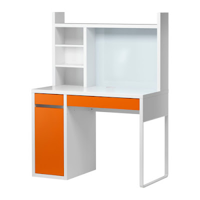
This desk from Ikea is simple with clean lines and just a punch of color. Would be great with some blue or green accessories on the shelves.


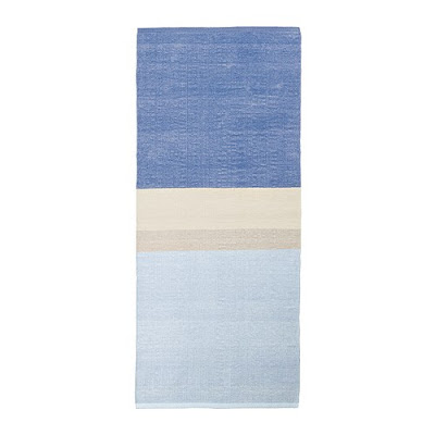
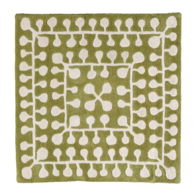
Rugs can be a great way to bring color and texture in to a room. I could see using the blue rug as a calming element if we were to use more pattern and punch on the walls and textiles. The patterned green rug would be fun if we were to keep the rest of the room more neutral.


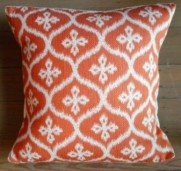
Throw pillows are one of my favorite ways to dress up a room. They are fun, inexpensive, and easy to change and move around. I loved both of these as options for Kenzie's room. The other thing I love about pillows is that you really can't go wrong with mixing patterns and colors...


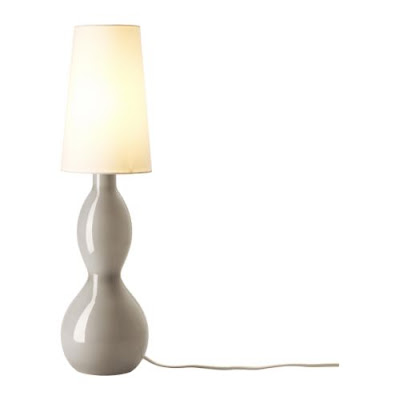
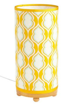
Another way to add some fun color and texture is through lighting. People often forget to think about the design of lighting within a space, but it can really make a design if done well!

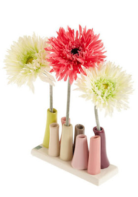
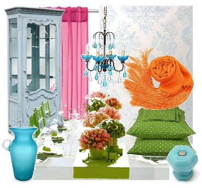
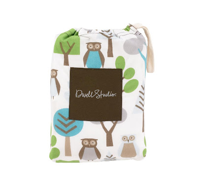
And of course, there are the small accessories. How cute would these elements be in a teen room? I love the bright colors and organic forms...


Accessory pairings...

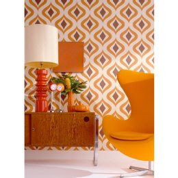
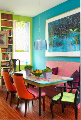
The small details are great, but ultimately we need to put them all together so that they create a balanced design scheme. Too much pattern and color and the design will become over-the-top, but we also don't want Kenzie's room to be boring. I chose the images below because they are fun and lively, while maintaining some sense of order. Bold prints are contrasted with solids colors and simple forms, something that is not always easy to pull off.


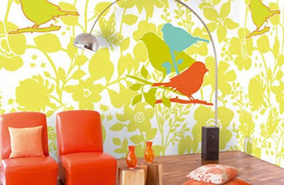
Putting it together...

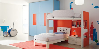
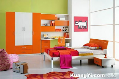
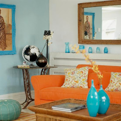
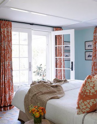
Last but not least, I found some rooms of differing styles that fit the desired color palette. I organized the photos with the more bold and modern rooms at the top and the more calming rooms at the bottom. Again, I'm not sure what look Kenzie is ultimately wanting, but this should give us a good starting point and at least get the conversation started!


Saturday, June 12, 2010

gorgeous vintage dresses

I found this site about an hour ago and have been salivating over it ever since...

Mill Crest Vintage is one of the best vintage clothing sites I have seen yet (although it is a bit pricey). I love the variety and it seems like it would be pretty easy to determine your size, unlike many other sites I have visited.

Here are a few of my favs!!

1930...


1950...


1960...

Saturday, May 8, 2010

baby b's tree

Here's a shot of Sarah and Dan's nursery mural with some of the furniture in place. I must say, I love it!!!

Thursday, May 6, 2010

creating room for baby

So apparently a week turned in to 3... my apologies on the delay in getting this update out! I know you are all anxiously awaiting details on how Camille of styLe handLer and I implemented our final nursery proposal in our dear friend Sarah's nursery, so wait no longer! All the details on this DIY project are below:

Once we had the design and color palette finalized and Sarah and Dan's approval to proceed, Camille and I blocked off a Friday and Saturday to execute the design.

Based on feedback from Sarah on the design of the tree, I brought the image in to Adobe Illustrator and did a live trace using the image of the simple tree with owls that we had identified from my first blog post. With the image in Illustrator, I was able to expand the image to 1:1 scale (for those of you unfamiliar with archi-speak, this mean that I expanded the file to life size). Just to put it in to perspective, Sarah's tree is almost 7 1/2' tall by 6' wide, which meant that the file I created was set on a virtual canvas of the same size!

Once I had the tree at 1:1 scale, I converted the file to Photoshop format, which allowed me make some more precise editions to the design. Sarah didn't want the owls on the tree, so I removed them and created new branches to fill out the blank spots. I also change the proportions a bit to work with the size of the nursery wall.

The ultimate goal in all of this prep work in Illustrator and Photoshop was to create live-size stencils to allow Camille and I to most accurately reproduce the tree on the nursery wall. Since the large format plotter I used maxed out at a paper size of 34" x 44" sheets, I had to section off the artwork to fit on the paper. The tree ended up filling five 34" x 44" sheets of paper!

The image below shows two of the five plots that were created. You can see that I put a border 1" into each of the sheets with numbered corners. This helped me piece the sections together in the end. The image within the 1 inch border was actually overlap from one sheet to the next, ensuring that none of the image would be cropped out due to printing margins.


After the plots were complete, the next step was to use an utility knife to cut out the tree form. The image below shows my progress on one of these sections... this was probably the most time consuming (although essential) part of the process!


Once I had completed cutting out the stencils, Camille and I methodically taped the pieces of paper to the wall. Imagine 3' by 4' paper snowflakes... this is how delicate some of the sheets ended up being! We had to very carefully line up the sections and tape them to the wall while keeping each sheet square so as not to distort the design.

A Helpful Hint: If you try this at home, start with the bottom piece to make sure you have the correct placement of the artwork. Then begin placing the sheets taping from the top first and then straightening downward.


The image below shows our progress. You will also notice that we taped over some of the more delicate leaves and branches. The purpose of the stencil was to allow us to trace the image on the wall accurately; it would not have been a good idea to paint directly over this paper stencil.


After we had traced the stencil with pencil, the paper came down and the paint started to go up! This was the fun part... I would, however, recommend purchasing some high quality brushes that come in smaller sizes (1/4" up to 2"). The edging can be difficult if you want nice crisp lines without these smaller brushes.


The final mural turned out amazingly! Camille and I were both pleased with the outcome and, more importantly, Sarah and Dan loved the final product.

I also must commend Sarah on her excellent foresight into the selection of the color palette for this room. The gray and cream, although atypical for a nursery, turned out perfectly. I love this space and cannot wait to see 'baby b' sleeping under this tree!

Sunday, April 18, 2010

designing room for baby

Back in January I gathered a bunch of baby inspiration for the design of my friend Sarah's nursery and posted some of my finds in the blog entry "make room for baby!" With the baby due in June, time is of the essence, so my friend and fellow design enthusiast Camille (style handler) and I have been busy over the last month preparing the final design proposal for baby b's new bedroom.

In my original post, I focused on many woodland themed elements, which became the inspiration for the room. Sarah knew she wanted a warm gray wall color with cream accents, which I immediately latched on to since it is such a fun and unusual palette! She and her husband Dan also picked out some adorable black furniture, which would be accessorized with the the cutest owl sheets from Dwell Studio.


After a trip down to her house to get measurements of the space, I immediately began a 3D model of the room using SketchUp (a free Google software for any of you interested in a fantastic design tool). Once I had the room in place, I modeled the crib and some of the other pieces of furniture in the room to get a very clear understanding of space and layout.

Once I had modeled the space, Camille and I sat down for a design session to figure out where to place the various pieces of furniture and what to do with the walls. It was during this session that we came up with our first iteration for the nursery (see below). We placed a large silhouette of a tree on the wall between the crib and the rocking chair to give a fun, yet simple and calming, design element to the room.


We loved this design as a starting point, but decided to work on the form of the tree to make it a bit more simplified. We also knew that the final design would need to work with light tree on a darker wall, so bigger and bolder shapes would probably work best.

After a trip to Home Depot to hash out the final paint color scheme (we ended up with a gorgeous warm gray and light buttery cream palette), we looked through some various tree designs with Sarah and came to one of the images I had originally posted on my blog. We loved the simple design of this tree, but decided to remove the owls and change the proportions a bit.


Once we had finalized the design, I uploaded the new tree into the SketchUp model so that I could provide Sarah with a final preview of the concept for the nursery before we began work on the space.

With Sarah on board, all we needed to do was start painting! I'll post more details this week...

Friday, April 2, 2010

vintage.wedding.inspiration

I came across this vintage-inspired photo shoot while browsing one of my favorite wedding blogs, Green Wedding Shoes. I love all the details that come together to create the stunningly romantic and antique feel...

Enjoy the eye candy!

images courtesy of

Wednesday, March 31, 2010

gorgeous wedding photograph

I found this photograph as I was searching the web for wedding inspiration for my younger sister and fell in love. The first contact between bride and groom is a huge part of the wedding day and I love how this photo documents this event...

Monday, March 29, 2010

erratic repertoire: the dress for all occasions

I don't typically highlight clothing on my blog, but had to make an exception today for this amazingly creative dress designed for me by Jenna of the blog Erratic Repertoire. This dress is reversible and, due to shape and cut, can be worn in a plethora of styles. I had a little photo shoot in my living room (with my cat Penelope, of course) and modeled a few of the styles that immediately came to my mind. Since this shoot, I've come up with many other iterations that are so fun!

Jenna has some images of a similar dress that she made for herself on her blog, so check it out. Maybe if she opens an Etsy page like I suggested, you can buy one for yourself!