Showing posts with label interior design. Show all posts

Saturday, February 19, 2011

help me finish our room!

So we got our new Room and Board sofa today and I'm so excited!

Now it's time for some redecorating and the first step is to find a rug and accent chair to spice it all up...


I am absolutely in love with this "Sweet As Honey" rug from Anthropologie, but I am NOT in love with the eight hundred dollar price tag for a 5x8 ($1,700 if we were to go with an 8x10)... so I am in search of some alternate rug + chair combos that can give me some fun color/texture at a better price tag.


Leave me your comments and give me your thoughts on which combo is your favorite!

Option 1: Neutral Chair with Colorful Rug
I love this chair from Room and Board, but at a $999 price tag it's a little more money than I am interested in spending. I would, however, be up for a few Saturday morning trips to the Room and Board Outlet to get a better deal. SO I'm not ruling it out yet... The gray color offers contrast to the neutral Pumice color of the couch and would allow us to use some fun color on the floor. For example... this amazing yellow rug from Anthropologie. Still a bit high priced at $500 for a 5x7.

Let's mark this pair as the high-end of the possibilities.


Here are some other gray chair options:


Here are some other "fun rug" options:


Option 2: Neutral Rug with Bold Chair
I love this Skyline "Esprit Oasis" chair and the $225 price tag is very reasonable. I'm not familiar with this company and may be a bit concerned with quality, but going with a less expensive chair could provide more opportunity for updates in the future. Clearly this print would overpower any of the rugs above and become WAY too hectic, so I've paired it with this "Channel Rug" from West Elm, $299 (5x8).


Here are some other chair options:


Thursday, February 17, 2011

mini bathroom remodel

Josh went out of town this last week and I took to our bathroom like a banshee... I first intended only to paint the vanity, but as I started ripping things up the scope of the project grew considerably.

Here is the before:


Don't you love the gold faucet and the hokey oak vanity? It's a bit dated to say the least... so I made my way to Home Depot and picked a new vanity color "Stealth Jet" that I would call a black with a great deal of depth; it almost has deep espresso undertones. Once I had the paint, it was all about prep work. The vanity needed to be cleaned with a degreaser, sanded, and "unhinged". The work took a few hours at least, but I got to use my new orbital sander, which saved a bunch of time!

Here's a shot in progress... yes you will also note I pulled the plumbing out, whoops! Penelope knows I've gotten myself in to some trouble.


And not just the plumbing... turns out there were some surprises for me waiting behind the old light bar fixture... who needs a junction box anyway?? It is only code... gotta love the random wires hanging out of my wall! Turns out I needed to put on my electrical hat as well.


One last hiccup before I get to the fun stuff... the picture below shows a hole in the wall the vanity light bar was hiding. I now understand why the previous owners failed to install the junction box... it turns out that center section of the hole is a stud that just happens to be on center with the rest of the vanity. A stud that is the entire depth of the wall cavity and prevents a light fixture to be mounted on center with the vanity fixture... I did end up cutting in a new box for safety, but then had to get creative with the new light fixture to install it on center. I had initially wanted a design that had a small mounting plate, but ended up having to go with a design with a longer mounting plate so that I could jerry-rig the new fixture on center with the vanity. Toggle bolts are now my best friend...

Once I cleared these hurdles, it was all execution and detail work. I picked up some new hardware for the vanity from Anthropologie (below) that really helps pick up on the 1940's character of our house (now I just need to convince my husband to let me replace the nasty gold door knobs throughout the house with crystal!).


And here are the after pics! It took me 3 solid days to complete, but I'm pretty happy with the update. What do you think??

Sunday, July 11, 2010

teen room design

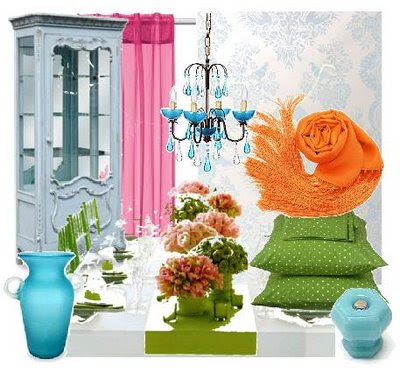
I have yet another room to design and I am pumped! My neice, Kenzie, is ready for a refresh of her bedroom. She's a freshman in high school and her favorite colors are orange, green, and blue. She wants to incorporate these colors in to her new room design, but was thinking about a more toned down palette on her walls with some punches of color via accessories. To jump start the room design process, I hit the web and have organized a bunch of photos for inspiration and possible directions. I have no idea if Kenzie would be interested in any of these ideas, but it should at least get us started!

The details...

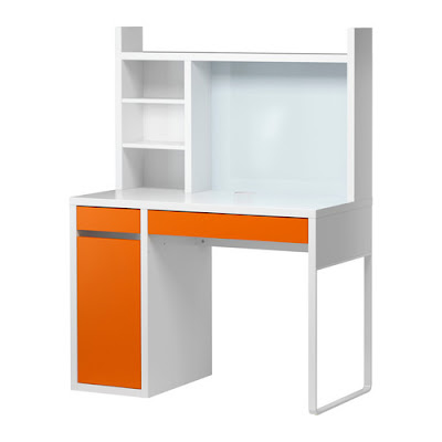
This desk from Ikea is simple with clean lines and just a punch of color. Would be great with some blue or green accessories on the shelves.


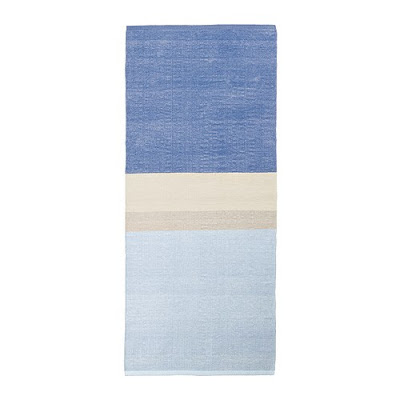
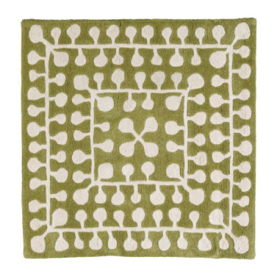
Rugs can be a great way to bring color and texture in to a room. I could see using the blue rug as a calming element if we were to use more pattern and punch on the walls and textiles. The patterned green rug would be fun if we were to keep the rest of the room more neutral.


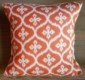
Throw pillows are one of my favorite ways to dress up a room. They are fun, inexpensive, and easy to change and move around. I loved both of these as options for Kenzie's room. The other thing I love about pillows is that you really can't go wrong with mixing patterns and colors...


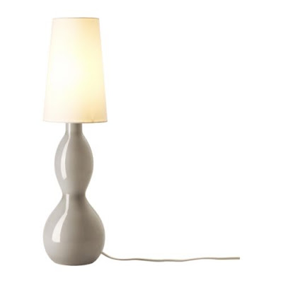
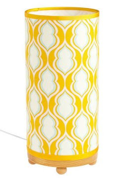
Another way to add some fun color and texture is through lighting. People often forget to think about the design of lighting within a space, but it can really make a design if done well!

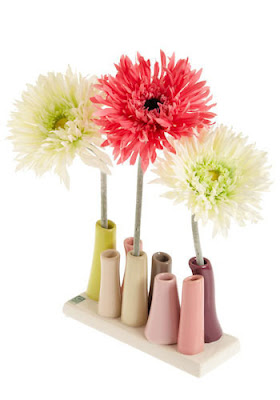
And of course, there are the small accessories. How cute would these elements be in a teen room? I love the bright colors and organic forms...


Accessory pairings...

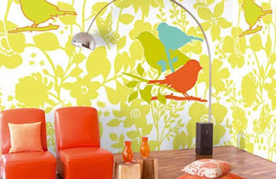
The small details are great, but ultimately we need to put them all together so that they create a balanced design scheme. Too much pattern and color and the design will become over-the-top, but we also don't want Kenzie's room to be boring. I chose the images below because they are fun and lively, while maintaining some sense of order. Bold prints are contrasted with solids colors and simple forms, something that is not always easy to pull off.


Putting it together...

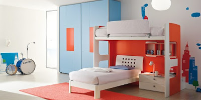
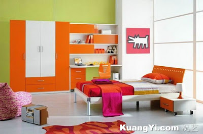
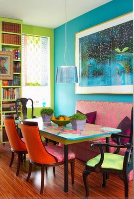
Last but not least, I found some rooms of differing styles that fit the desired color palette. I organized the photos with the more bold and modern rooms at the top and the more calming rooms at the bottom. Again, I'm not sure what look Kenzie is ultimately wanting, but this should give us a good starting point and at least get the conversation started!


Thursday, May 6, 2010

creating room for baby

So apparently a week turned in to 3... my apologies on the delay in getting this update out! I know you are all anxiously awaiting details on how Camille of styLe handLer and I implemented our final nursery proposal in our dear friend Sarah's nursery, so wait no longer! All the details on this DIY project are below:

Once we had the design and color palette finalized and Sarah and Dan's approval to proceed, Camille and I blocked off a Friday and Saturday to execute the design.

Based on feedback from Sarah on the design of the tree, I brought the image in to Adobe Illustrator and did a live trace using the image of the simple tree with owls that we had identified from my first blog post. With the image in Illustrator, I was able to expand the image to 1:1 scale (for those of you unfamiliar with archi-speak, this mean that I expanded the file to life size). Just to put it in to perspective, Sarah's tree is almost 7 1/2' tall by 6' wide, which meant that the file I created was set on a virtual canvas of the same size!

Once I had the tree at 1:1 scale, I converted the file to Photoshop format, which allowed me make some more precise editions to the design. Sarah didn't want the owls on the tree, so I removed them and created new branches to fill out the blank spots. I also change the proportions a bit to work with the size of the nursery wall.

The ultimate goal in all of this prep work in Illustrator and Photoshop was to create live-size stencils to allow Camille and I to most accurately reproduce the tree on the nursery wall. Since the large format plotter I used maxed out at a paper size of 34" x 44" sheets, I had to section off the artwork to fit on the paper. The tree ended up filling five 34" x 44" sheets of paper!

The image below shows two of the five plots that were created. You can see that I put a border 1" into each of the sheets with numbered corners. This helped me piece the sections together in the end. The image within the 1 inch border was actually overlap from one sheet to the next, ensuring that none of the image would be cropped out due to printing margins.


After the plots were complete, the next step was to use an utility knife to cut out the tree form. The image below shows my progress on one of these sections... this was probably the most time consuming (although essential) part of the process!

Once I had completed cutting out the stencils, Camille and I methodically taped the pieces of paper to the wall. Imagine 3' by 4' paper snowflakes... this is how delicate some of the sheets ended up being! We had to very carefully line up the sections and tape them to the wall while keeping each sheet square so as not to distort the design.

A Helpful Hint: If you try this at home, start with the bottom piece to make sure you have the correct placement of the artwork. Then begin placing the sheets taping from the top first and then straightening downward.


The image below shows our progress. You will also notice that we taped over some of the more delicate leaves and branches. The purpose of the stencil was to allow us to trace the image on the wall accurately; it would not have been a good idea to paint directly over this paper stencil.


After we had traced the stencil with pencil, the paper came down and the paint started to go up! This was the fun part... I would, however, recommend purchasing some high quality brushes that come in smaller sizes (1/4" up to 2"). The edging can be difficult if you want nice crisp lines without these smaller brushes.


The final mural turned out amazingly! Camille and I were both pleased with the outcome and, more importantly, Sarah and Dan loved the final product.

I also must commend Sarah on her excellent foresight into the selection of the color palette for this room. The gray and cream, although atypical for a nursery, turned out perfectly. I love this space and cannot wait to see 'baby b' sleeping under this tree!