Showing posts with label DIY. Show all posts

Thursday, February 17, 2011

mini bathroom remodel

Josh went out of town this last week and I took to our bathroom like a banshee... I first intended only to paint the vanity, but as I started ripping things up the scope of the project grew considerably.

Here is the before:


Don't you love the gold faucet and the hokey oak vanity? It's a bit dated to say the least... so I made my way to Home Depot and picked a new vanity color "Stealth Jet" that I would call a black with a great deal of depth; it almost has deep espresso undertones. Once I had the paint, it was all about prep work. The vanity needed to be cleaned with a degreaser, sanded, and "unhinged". The work took a few hours at least, but I got to use my new orbital sander, which saved a bunch of time!

Here's a shot in progress... yes you will also note I pulled the plumbing out, whoops! Penelope knows I've gotten myself in to some trouble.


And not just the plumbing... turns out there were some surprises for me waiting behind the old light bar fixture... who needs a junction box anyway?? It is only code... gotta love the random wires hanging out of my wall! Turns out I needed to put on my electrical hat as well.


One last hiccup before I get to the fun stuff... the picture below shows a hole in the wall the vanity light bar was hiding. I now understand why the previous owners failed to install the junction box... it turns out that center section of the hole is a stud that just happens to be on center with the rest of the vanity. A stud that is the entire depth of the wall cavity and prevents a light fixture to be mounted on center with the vanity fixture... I did end up cutting in a new box for safety, but then had to get creative with the new light fixture to install it on center. I had initially wanted a design that had a small mounting plate, but ended up having to go with a design with a longer mounting plate so that I could jerry-rig the new fixture on center with the vanity. Toggle bolts are now my best friend...

Once I cleared these hurdles, it was all execution and detail work. I picked up some new hardware for the vanity from Anthropologie (below) that really helps pick up on the 1940's character of our house (now I just need to convince my husband to let me replace the nasty gold door knobs throughout the house with crystal!).


And here are the after pics! It took me 3 solid days to complete, but I'm pretty happy with the update. What do you think??

Thursday, May 6, 2010

creating room for baby

So apparently a week turned in to 3... my apologies on the delay in getting this update out! I know you are all anxiously awaiting details on how Camille of styLe handLer and I implemented our final nursery proposal in our dear friend Sarah's nursery, so wait no longer! All the details on this DIY project are below:

Once we had the design and color palette finalized and Sarah and Dan's approval to proceed, Camille and I blocked off a Friday and Saturday to execute the design.

Based on feedback from Sarah on the design of the tree, I brought the image in to Adobe Illustrator and did a live trace using the image of the simple tree with owls that we had identified from my first blog post. With the image in Illustrator, I was able to expand the image to 1:1 scale (for those of you unfamiliar with archi-speak, this mean that I expanded the file to life size). Just to put it in to perspective, Sarah's tree is almost 7 1/2' tall by 6' wide, which meant that the file I created was set on a virtual canvas of the same size!

Once I had the tree at 1:1 scale, I converted the file to Photoshop format, which allowed me make some more precise editions to the design. Sarah didn't want the owls on the tree, so I removed them and created new branches to fill out the blank spots. I also change the proportions a bit to work with the size of the nursery wall.

The ultimate goal in all of this prep work in Illustrator and Photoshop was to create live-size stencils to allow Camille and I to most accurately reproduce the tree on the nursery wall. Since the large format plotter I used maxed out at a paper size of 34" x 44" sheets, I had to section off the artwork to fit on the paper. The tree ended up filling five 34" x 44" sheets of paper!

The image below shows two of the five plots that were created. You can see that I put a border 1" into each of the sheets with numbered corners. This helped me piece the sections together in the end. The image within the 1 inch border was actually overlap from one sheet to the next, ensuring that none of the image would be cropped out due to printing margins.


After the plots were complete, the next step was to use an utility knife to cut out the tree form. The image below shows my progress on one of these sections... this was probably the most time consuming (although essential) part of the process!


Once I had completed cutting out the stencils, Camille and I methodically taped the pieces of paper to the wall. Imagine 3' by 4' paper snowflakes... this is how delicate some of the sheets ended up being! We had to very carefully line up the sections and tape them to the wall while keeping each sheet square so as not to distort the design.

A Helpful Hint: If you try this at home, start with the bottom piece to make sure you have the correct placement of the artwork. Then begin placing the sheets taping from the top first and then straightening downward.


The image below shows our progress. You will also notice that we taped over some of the more delicate leaves and branches. The purpose of the stencil was to allow us to trace the image on the wall accurately; it would not have been a good idea to paint directly over this paper stencil.


After we had traced the stencil with pencil, the paper came down and the paint started to go up! This was the fun part... I would, however, recommend purchasing some high quality brushes that come in smaller sizes (1/4" up to 2"). The edging can be difficult if you want nice crisp lines without these smaller brushes.


The final mural turned out amazingly! Camille and I were both pleased with the outcome and, more importantly, Sarah and Dan loved the final product.

I also must commend Sarah on her excellent foresight into the selection of the color palette for this room. The gray and cream, although atypical for a nursery, turned out perfectly. I love this space and cannot wait to see 'baby b' sleeping under this tree!

Sunday, April 18, 2010

designing room for baby

Back in January I gathered a bunch of baby inspiration for the design of my friend Sarah's nursery and posted some of my finds in the blog entry "make room for baby!" With the baby due in June, time is of the essence, so my friend and fellow design enthusiast Camille (style handler) and I have been busy over the last month preparing the final design proposal for baby b's new bedroom.

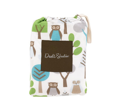
In my original post, I focused on many woodland themed elements, which became the inspiration for the room. Sarah knew she wanted a warm gray wall color with cream accents, which I immediately latched on to since it is such a fun and unusual palette! She and her husband Dan also picked out some adorable black furniture, which would be accessorized with the the cutest owl sheets from Dwell Studio.


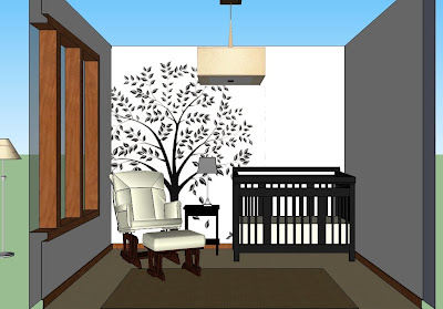
After a trip down to her house to get measurements of the space, I immediately began a 3D model of the room using SketchUp (a free Google software for any of you interested in a fantastic design tool). Once I had the room in place, I modeled the crib and some of the other pieces of furniture in the room to get a very clear understanding of space and layout.

Once I had modeled the space, Camille and I sat down for a design session to figure out where to place the various pieces of furniture and what to do with the walls. It was during this session that we came up with our first iteration for the nursery (see below). We placed a large silhouette of a tree on the wall between the crib and the rocking chair to give a fun, yet simple and calming, design element to the room.


We loved this design as a starting point, but decided to work on the form of the tree to make it a bit more simplified. We also knew that the final design would need to work with light tree on a darker wall, so bigger and bolder shapes would probably work best.

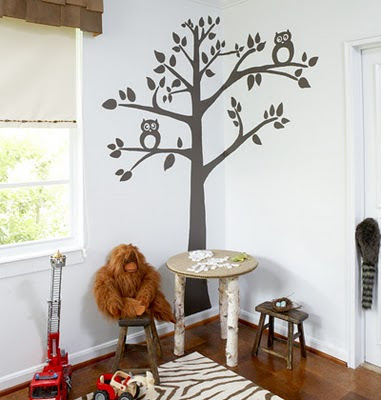
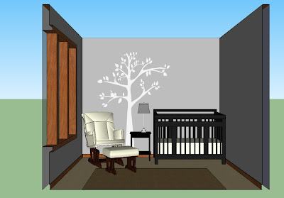
After a trip to Home Depot to hash out the final paint color scheme (we ended up with a gorgeous warm gray and light buttery cream palette), we looked through some various tree designs with Sarah and came to one of the images I had originally posted on my blog. We loved the simple design of this tree, but decided to remove the owls and change the proportions a bit.


Once we had finalized the design, I uploaded the new tree into the SketchUp model so that I could provide Sarah with a final preview of the concept for the nursery before we began work on the space.

With Sarah on board, all we needed to do was start painting! I'll post more details this week...

Sunday, March 7, 2010

diy project .:. vintage cake stands

Wedding plans have been keeping me very busy lately, but I love the little details that go into planning the event. I love dessert and thought that having individual and ornate desserts served on each guest table could create a beautiful and unique center piece. I was immediately drawn to the classic antique milk glass cake stands as they are simple, elegant, and fit our vintage theme. While these pieces are stunning, they are a bit pricey, so I decided to get creative and make my own custom cake stands for the guest tables at our wedding reception.

During one of my intense online wedding research sessions I found an interesting post on one of my favorite blogs, Design Sponge, about adaptive reuse of plates and china (please see my previous post on the marvelous Sarah Cihat and her inspirational and funky dishware adaptations). Design Sponge even highlighted a DIY project creating Sarah Cihat-inspired cake stands that I was instantly drawn to. Of course, I didn't want to paint bugs on my wedding centerpieces, so I went a more elegant route and have been collecting antique china plates and crystal stemware from various antique shops over the last few months in the hopes of adding some creative glamor to my wedding reception.

This last weekend, my sister and I went at the first 30 stands, using Epoxy to secure the crystal stemware to the bases of each plate. We used varying heights, shapes, and colors to add visual interest and rhythm. I love the outcome and can't wait to see them at our wedding. I'm thinking some soft loose blooms and LED lights would look stunning clustered around the bases of these stands.

Enjoy!

I adore milk glass and these pieces are absolutely stunning. These stands were my original inspiration for my guest table decor.

My sister and I collected mismatched china plates, crystal stemware, and candlesticks like those pictured above over the course of a few months (and many visits to the Antique Emporium in Eau Claire, WI). Once they were cleaned and sparkling, we organized them so that each plate was paired with the perfect base, offering variety of height, color, and design.


Phase two was all about the smelly Epoxy... we glued the 30 plates and bases together within a couple of hours and then secured them with painters tape and set them out to dry for the night. I wasn't sure that the Epoxy would hold the delicate crystal to the china, but that stuff is amazing!!

The finished product is surprisingly durable (and pretty cute)!